A strong brand identity will help you stand out from the crowd and make sure your customers remember who you are. It also helps you build trust with potential customers and increase conversions.
In order to create a powerful brand, you must first understand your customer. You must learn everything you can about your target audience and how they interact with products and services. Once you’ve done that, you can design a logo, tagline, website, and even a product that reflects your brand values.
| Are you looking for the top market-listed logo maker to create your brand’s logo, then check our best logo maker review articles below to choose the one that suits your business. |
In this article, we’ll share 10 tips to help you create a powerful brand identity that will set you apart from the competition. We’ll go over what makes up good brand identity and why it’s important for startups.
10 Ways to Make Your Startup’s Branding Stand Out
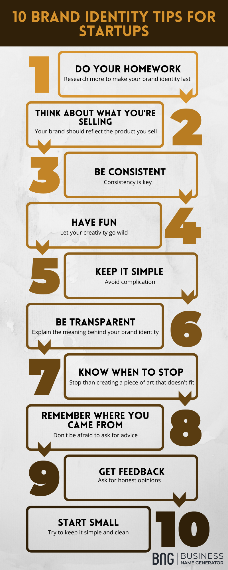
1) Do your homework – don’t just create something simply because you think it’s cool. If you want your brand identity to last, make sure that its design is not only visually appealing but also reflects your company values.
2) Think about what you’re selling – if you are trying to sell a product or service for example, then your logo should reflect that. If you have a unique product, then you can use a simple graphic to represent it. If you are just starting out, then I suggest using a simple font and adding some text.
3) Be consistent – if you are creating a brand identity for yourself, then consistency is key. Make sure that everything from your logo to your website and social media accounts is cohesive and matches each other.
4) Have fun – let your creativity go wild! Use bright colors and try different shapes. Don’t worry too much about making things perfect. Just give it a shot and see how it turns out.
5) Keep it simple – avoid complicated designs and logos. They might look good at first but they can become overwhelming over time.
6) Be transparent – explain the meaning behind your brand identity. This way, your customers won’t feel like you are hiding anything.
7) Know when to stop – once you start designing a logo, you may find it hard to stop. But sometimes it’s better to leave something unfinished than to end up with a piece of art that doesn’t fit in well with your business.
8) Remember where you came from – as a startup founder, you probably had no idea what you were doing when you started your business. And chances are, you didn’t know what kind of brand identity you needed either. So don’t be afraid to ask for advice. Talk to people who have been through similar situations before.
9) Get feedback – get feedback on your brand identity from both friends and strangers. Ask them what they think and get their honest opinions.
10) Start small – your brand identity shouldn’t blow up your entire website. Try to keep it simple and clean.
If you’re looking to grow your startup, there are many ways you can do so. However, one thing that often gets overlooked is branding. The truth is, that branding has a huge impact on how successful your startup becomes. Let’s take a closer look at what exactly branding means and how it can benefit your startup.
Things to Avoid When Creating a Brand Identity
Building a strong and unique brand identity is critical for all business’s success. Your brand identity is more than a flashy logo or a clever phrase; it is the personality, values, and image your company projects to the outside world. There are, nevertheless, certain mistakes to avoid when developing your brand identity. To learn more, see our video ‘5 Mistakes to Avoid When Crafting Your Brand Identity’ below.
Our Best Tips
- Define your mission and values
- Develop a strong marketing strategy
- Create consistent messaging
- Be authentic and genuine
- Stand out from the competition
- Use social media to build awareness
- Foster customer loyalty
- Measure and track results
- Keep it simple
Advice for Startups
- Develop your brand strategy
- Create a unique brand
- Invest in design
- Tell your story
- Pay attention to your demographic
- Use social proof
- Communicate your brand values
- Consistency is key
- Maintain design standards
- Track your brand
| Once you are done with creating a logo and tagline for your business, it is now time to set up a website for your business. Do you want help in choosing the best website builder, then check out our reviews below. |
Conclusion
Brand identity is one of the most important aspects of a startup. A strong brand identity can help your startup stand out from the competition and create a memorable experience for customers.